Thursday, April 10, 2014

53. Star plots

http://stratochem.com/?attachment_id=371
A star plot is a radar chart that display multivariate data in a 2D chart or several quantitative variables that start from the same point. In this example you can see that there are four distinguishable spoke that is proportional to the magnitude of the variable it is representing. This gives it its star-like appearance, but the function of a map like this is handy when observers want to know where the clusters are, which is most similar or dissimilar points, and if there are any outliers. You can compare the red line with the blue to see how they compare and contrast.

52. Correlation matrix

http://www.emeraldinsight.com/journals.htm?articleid=1515237
Correlation Matrix is a table that display the correlation coefficients in several markets in various time frames. To put it simply, it gives the correlation between all pairs of data sets. This is an example of an industrial marketing team organizing their data in a model that helps them visualize the correlation for their study variables.

51. Similarity matrix

http://tomcat.esat.kuleuven.be/txtgate/tutorial.jsp
A similarity matrix is a matrix of values plotted on this graph measure the similarity between two data points. The purposes of this is to find clusters in data points and align DNA sequences. In this example, the data analyze the relationship between human genes and how they correlate to one another. f you look at the similarity color legend, the more red it is, the greater the difference.

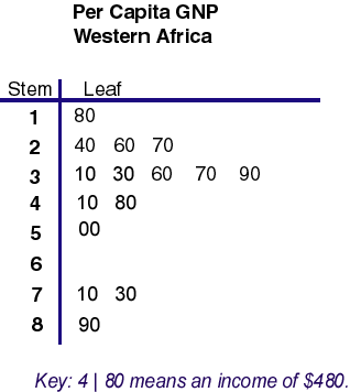
50. Stem and leaf plot

http://mainland.cctt.org/mathsummer/josephbond/stemandplots/stem-and-leaf_std.htm
A stem-and-leaf-plot displays data in an organized shape and distribution by splitting each data value into a "stem" and "leaf". This is strategic way to organize a set of data with many large values, and this technique group the numbers with the same stems. For example, this maps per capita GNP Western Africa. You can see in the key that 4 is the stem, and 80 is the leaf, and together that represents an income of $480. These kind of plots are used to help analysts look over large amount of numbers, by putting the largest digits on the stem and digits in the smallest place as the leaves.

49. Box plot

http://rtutorialseries.blogspot.com/2010/02/r-tutorial-series-regression-with.html
A box plot graphically depict groups of numerical data in quartiles. It is a standard way to display the distribution of data using a summary of the minimum, first quartile, median, third quartile and maximum. For a map like this, you can see what a box plot is useful in giving us a visualization of statistical measures of a team's salary. You can easily discover all five of the variables mentioned, such as, who makes the most in the AFC? Who makes the least? What is the average salary? Additionally, a box plot allows you to compare one group with another (AFC vs NFC)  based on their min, max, mean values.

Wednesday, April 9, 2014
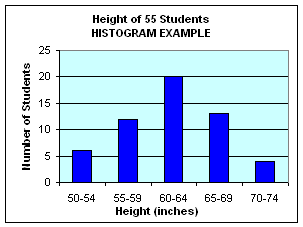
48. Histogram

http://www.ct4me.net/Ohio_Graduation_Math_Test_Prep_DataStrand.htm
A histogram is a graphical representation of data distribution. This graph display data of different heights, with the horizontal axis continuous in a progressive number line, while the other axis show how many students are in that range of height. Histogram is useful source to show distribution of data in categories such as weight, height, how much time, etc.

47. Parallel coordinate graph

http://vis.lbl.gov/Vignettes/Drosophila/index.html
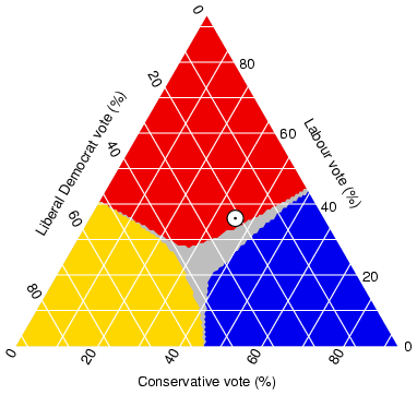
A parallel coordinate graph display the relationship between multiple variables by visualizing high-dimensional geometry. Viewers can look at many different variables simultaneously. This example is interested in visualizing the expression of genes. By using a parallel coordinate graph, scientists are able to utilize spatial information and its relationship between different gene's expression patterns. The parallel coordinates represent each gene in a parallel axis where expression levels are defined on a point of each axis. Connecting these points of axes allow cell to be represented by a polyline.

46. Triangular plot

http://www.ex-parrot.com/~chris/wwwitter/20050407-it_doesnt_matter_how_you_vote_either_way_your_planet_is_doomed.html
Triangular plots show the relationship between three variables that sum up to a uniform whole. For example, this shows the percentage of Liberal Democrat, Labour and Conservative votes in an election. This is useful for political campaigns to analyze the three main parties and see an estimated fraction of the population voting for their major parties. Another good example of triangular plot I've seen is of soil composition and the three variable that soil is composed of.

45. Windrose

http://www.nc-climate.ncsu.edu/windrose.php
Windrose is a tool that meteorologist use to measure wind speed and direction distributed at a particular location. This is from and Airport in Raleigh, NC and the length of the vectors show the percentage of wind from that direction and wind speed is color coordinated to the legend. Looking at this you can observe which "spoke" is longest, and that is related to the frequency where wind blows the most often. This is useful for constructing airport runaways so aircraft can have the best advantage at take offs and landing.

44. Climograph

http://www.colorado.edu/geography/extra/geogweb/bouldercreek-2/preview/page2.html
A climograph represents monthly average temperature and precipitation at a certain location. The bar graph show the precipitation and the line graph represents the temperature. This helps analyst document dry or wet seasons and determine the type of land it is (arid, semi-arid, tropical, etc). As you can see this is the temperature and precipitation average for Boulder, Colorado.

43. Population profile

http://www.census.gov/2010census/
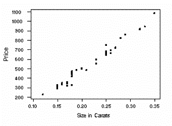
Population profile is a chart that shows the number of people as a function of their ages. This is collected by the US Census Bureau on selected racial, ethnic groups, age groups, various socio-economic categories, etc. In this map, population by sex and age are measured in the District of Columbia. This is useful for predicting population growth or decline.

42. Scatterplot

http://www.stat.yale.edu/Courses/1997-98/101/scatter.htm
A scatterplot plots points to show the relationship between two sets of data, to find a correlation. If the two sets are strongly linked, that means they have a high correlation, and can either be positive or negative. In this example, the size of a diamond in carats and its retail price are observed. We can clearly see that there is a positive correlation between size and price. Because the plots are so close together and line up near perfectly (with little scatter), this is a high positive correlation. Which means that the bigger the size, the more expensive the diamond is.

41. Index value plot

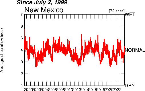
http://waterwatch.usgs.gov/new/?m=real&w=plot&r=nm
An index value plot is a map that graphs index value on a line graph that is easy for comparison to what is the "normal" value based on the collected set of data. This example shows the average streamflow index in New Mexico over a decade, and the average stream flow index is at the value 4. So the USGS can use this to analyze each year on whether it has been a wet or dry year and see any variations or discrepancies from the normal.

40. Accumulative line graph or Lorenz curve

http://worthwhile.typepad.com/worthwhile_canadian_initi/2011/09/why-are-we-still-using-the-gini.html
A Lorenz Curve shows income distribution among a population by using a cumulative data to plot inequality of wealth distribution. In this case, each population from Denmark, UK, Russia, Netherlands, Korea and Brazil were each cumulatively gathered to plot for comparison of income. This show the degree of inequality between the two observed variables (Korea and Brazil) among the four European nations.

39. Bilateral graph

http://commerce.nic.in/publications/anualreport_chapter9.asp
Bilateral graph represents more than one variable and can be portrayed using line or bar graphs. In this graph, you can see that this type of presentation is useful for comparing bilateral trade with the Commonwealth of Independent States. There are three variable represented (exports, imports, total trade) and this is helpful for comparison as well as giving accurate raw data.

38. Nominal area choropleth map

https://courseware.e-education.psu.edu/courses/geog482/policies.shtml
Nominal area choropleth map is a thematic map that measures unordered categories. Because there is no ranking order, any color can be used to measure categories such as race, age, martial status, etc. In this example, nominal-level data is presented with distinguish colors representing which minority race occupy the highest percent of the state population. This type of map helps analysts/viewers compare data and get a simple general idea without too much specific details.

37. Unstandardized choropleth maps

http://eps.mq.edu.au/courses/GEOS219/choropleth.htm
Unstandardized choropleth map display data with raw numbers that are not aerially averaged. Like other thematic maps, it uses different progressive shading to represent the classes from low to high values of deaths per 1,000 live births in Australia.  Unlike the last post, this data has not been averaged or standardized to per square mile.

Tuesday, April 8, 2014

36. Standardized choropleth maps

http://www.statcan.gc.ca/pub/92f0138m/2008003/figures/5200001-eng.htm
A standardized choropleth map calculates the population per square mile, normalizing its data to a certain area. The data is in form of a percentage, and is represented with shades of colors so that this mapping technique can easily be compared. This map references the percentage of population aged 14 and younger in Canada. Viewers can glance at this and see that the darkest shade of green is generally in the center while the lighter shades (indicating low population of teenagers) are on the border/coast of the country. This map is a thematic map that focus on a single theme with a set of statistical data in an area.

35. Univariate choropleth maps

http://www.clearlyandsimply.com/clearly_and_simply/2009/06/multicolored-choropleth-maps-with-excel.html
A univariate choropleth map is simply a map that is limited to one variable. This map shows what each state commonly calls a generic soft drink, corresponding to the specific color: pop (in clue), soda (in gold) or coke (in red)? Unlike the last post about bivariate choropleth map, this is easier to read and is straightforward. Some more examples of univariate choropleth maps are population density, annual rainfall, birthrates, or any single set of data that is desired.

34. Bivariate choropleth maps

http://www.geo.unizh.ch/~annal/Choropleth%20maps.html
Bivariate choropleth maps combine different sets of data to display two variables on a single map by using symbols and colors. This allows the map maker to show the relativity between the first variable to the second. In comparison to a univariate choropleth map, a bivariate is a bit harder to read but it can be an effective tool to explore the geographical relationship visually. In this example, you can see that this map combines two sets of data: percentage of population under age 18 (in orange shades) with the percentage of rural population (in blue shades). The linear relationship between the two data is expressed in the lower left corner where we can observe an overlapping trend.

33. Unclassed choropleth maps

http://indiemapper.com/app/learnmore.php?l=choropleth
Unclassed Choropleth map does not use numerical values like classed choropleth, but instead it uses a range color shades to portray lighter colors as low values and darker shades to represent the progressively higher values. This essentially filters out data details, and just let you see the general idea of a geographic pattern (of unemployment rate in this map). The limitation in this map is that although you can observe the pattern of high unemployment rate in California, you can't actually rank the counties in the state from low to high. Another main problem with this is that you can hardly match up the colors on the map to the legend, which makes it difficult for viewers to read.

32. Classed choropleth maps

http://indiemapper.com/app/learnmore.php?l=choropleth
A classed choropleth portrays statistic information within a specified boundary. This map utilizes a color scheme (from light to dark) to organize a pattern of spatial organization of information without portraying specific numbers, just its numerical averages. The light to dark corresponds to low to high ranges within the city. This is very similar to the thematic map that I posted earlier.

31. Range graded proportional circle map

http://www.e-cartouche.ch/content_reg/cartouche/cartdesign/en/html/ThemMaps_ThemData.html
The difference between a range graded proportional circle map to the previously discussed continuous variable proportional circle map is that this set values within a range and utilizes a legend for depict what set of values each size of a circle represent. As you can see in this map, the legend has four circle sizes with a range of value to give an overall idea of how many inhabitants of the Communes are in the Region of Zurich. This has some advantages and disadvantages. While it avoids overcrowding because number of symbols can be altered to cover value range and small symbols represent large values, the main downfall is that the symbols do not express exact values. If you wanted to know a specific number of inhabitants, you would only have a general range idea.

30. Continuously variable proportional circle map

https://www.e-education.psu.edu/geog486/book/export/html/1796
A continuously variable proportional circle map uses varying circles that contain values that are continuous. Unlike proportional circle map, the circles values are not just in a range of values, but rather a specific value. This map of France is dated  back to 1850s, which was when proportional circles were first used on a map proportional to the values that are being mapped. The creator shows how the proportion of meat that were sent to Paris butcheries from different regions across France.

29. DOQQ

https://www.lib.ncsu.edu/gis/doqq.html
Digital Orthophoto Quarter Quadrangle (DOQQ) are digital aerial images that are spatially accurate with planimetric feature in true geographic positions. A DOQ uses a 1:12,000 scale representations of a quarter of an area, and comes from a conventional USGS 7.5 minute topographical map. However, a format of a DOQQ differs from DOQ because it covers one quarter of a quadrangle (four 1:12,000 scale versus just one 1:24,000 DOQ). This example is of Johnston County, Nebraska in 1998.

28. DEM

http://www.weather.unisys.com/usgs/index.php
Digital Elevation Model (DEM) is a three-dimensional representation of cartographic information in a raster form. DEM represents Earth's terrain's surface. In this map, you can see that it is split up in a grid, and each of the cell has a value corresponding to an elevation. If you click on the site I have linked above, you can click on any cell you'd like to zoom in and observe a more detailed map of the elevations corresponding to the legend. The rainbow scale show that white outline coasts, state, country, gray is county outlines, black represents rivers, red is highways, light red is interstate and magenta stands for national parks. A few common uses of DEM are to extract terrain parameters, create relief maps, and surface analysis.

27. DLG

http://www.dnr.sc.gov/GIS/descdlg.html
Digital Line Graphs (DLGs) are vector representations of features on USGS topographic maps by using common scales of 1:24,000 and 1:100,000. (However they can be distributed in large, intermediate, and small scale with a variety of features). Some main features on each layers include boundaries, transportation, surface water, contours, vegetative surface cover, roads and pipelines. For example, the boundaries layer would feature state, county, city, national and state lands such as parks or forests. Hydrography represent water surfaces such as flow/standing water and wetlands. Hypsography features contours and spot elevations.

26. DRG

http://egsc.usgs.gov/isb//pubs/factsheets/fs08801.html
Digital Raster Graphics (DRGs) are scanned images from U.S. Geological Survey (USGS) topographic maps that has all map collar information. The image of the map neatline is georeferenced to the surface of the earth and projected to the Universal Transverse Mercator (UTM). This specific map is a part of Washington West, D.C. DRG, a useful backdrop for other digital data to be overlaid. For example, in combination with DOQs and DRGs, the hybrid product can create digital elevation models.

25. Isopleths

http://geographyfieldwork.com/DataPresentationMappingTechniques.htm
Isopleth is a line connecting all points of equivalent numerical value of a variable. Examples of that value could be a population figure or geographic measurement. This variable can't be measured at point, therefore data is collected at this area and it is calculated to plot. This map is ideal for depicting change over space as the boundary lines do not abruptly change such as on a choropleth map.

24. Isopach

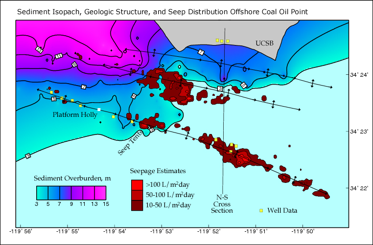
http://seeps.geol.ucsb.edu/pages/isopach.html
Isopach is a line that connects points of equivalent thickness of a geologic formation on a map. Isopach map illustrates thickness variations in a layer or tabular unit. In this map, the contour describes the overburden sediment of the ocean floor. The legend represents green transition into pink to show the progression of the thickness. As the pink increases, the greater the thickness. Seasonal changes in currents and waves causes the 3 meter differences in sediment overburden thickness.

Monday, April 7, 2014
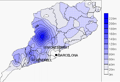
23. Isohyets

http://traveloutbackaustralia.com/start-here/outback-climate-and-weather.html
Isohyet is a line that connects equivalent points rainfall in a given period on a map. This map observes rainfall in Australia, the driest continent (aside from Antarctica), with an annual rainfall of less than 500 mm a year. For example, as you can see it connects Longreach to Charleville (which are two points both in the 400-500 mm range) in a contour line to illustrate exactly how much rainfall an area gets.

22. Isotachs

http://www.erh.noaa.gov/btv/events/28Oct2008/ua2.php
Isotach is line connecting equal points of wind speed on a map. This image is a snowstorm case review of North Dakota, indicating a strong upper tropospheric jet across the northeast region. Analysts that study this can observe the wind speed and directions of the lines to predict future forecasts.

21. Isobars

http://www.nc-climate.ncsu.edu/edu/k12/.IsobarIsotherm
Isobars are lines of equal atmospheric pressure on a weather map. The red L indicate areas of low pressure and the blue H present areas of high pressure. The isobars are the lines circling them. Generally wind flow from areas of high pressure to low, so meteorologists uses this to predict future forecasts. Low pressure has increase chances of precipitation whereas high pressures is associated with clear conditions. The closer the isobars are together, the more wind is to be expected. Any elongated areas in low and high pressures are "troughs" and "ridges."

20. LIDAR

http://www.noaanews.noaa.gov/stories/s798.htm
Light Detection and Ranging (LIDAR) is a remote sensing method that uses light from a pulse laser to examine the surface of the Earth. This image is data collected by the National Oceanic and Atmospheric Administration (NOAA) of lower Manhattan, New York. As you can see, the light pulses generate a three-dimensional structure of the city's surface and its characteristics. Mappers study LIDAR maps for natural and man-made environments. In fact, this model was created in October 30, 2001 by NOAA after September 11 so that the 3-D images of the site can help crew recover and clean up the area. This image help them pinpoint structures,  and identify the height of the buildings so they can measure cranes to remove it.

19. Doppler radar

http://www.srh.noaa.gov/tae/?n=event-20090413
 A Doppler radar shows the location and intensity of precipitation of a selected area. This is a Doppler Radar of Tallahassee from a severe weather and flooding from April 13, 2009, showing six bow echoes across the area. In this specific map, there are red polygons to indicate tornado warnings, yellow for severe thunderstorm, and blue for marine warnings. Click here for direct access to view the United States Doppler Radar map on Weather.com. This is updated live every 15 minutes, and you can select the region you are interested in to find out the radar-detected precipitation and the intensity in any area you're interested in. The legend states that green is for light precipitation, while yellow, orange and red relates to heavier rain.

Saturday, April 5, 2014

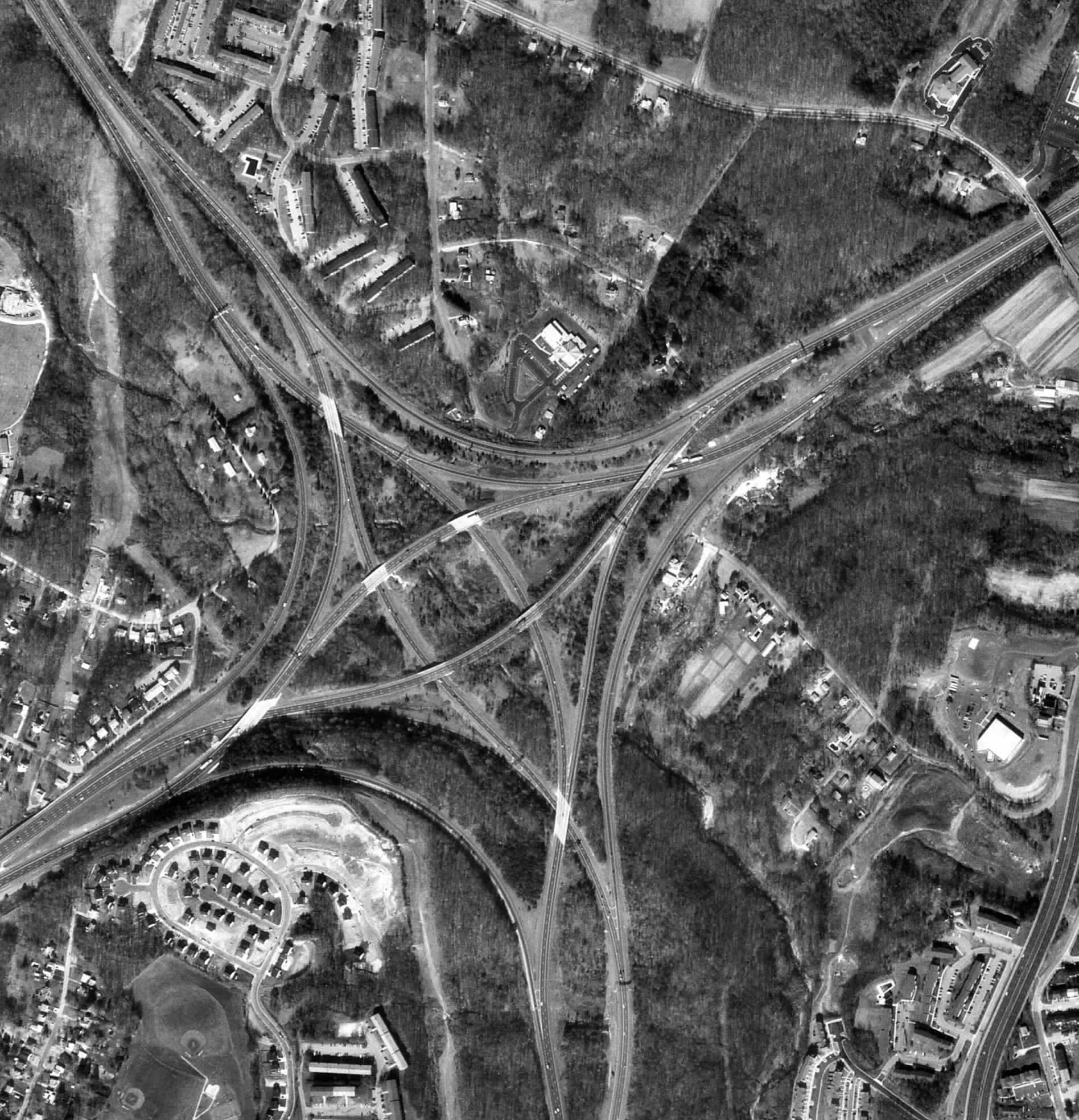
18. Black & white aerial photo

http://www.math.toronto.edu/drorbn/Gallery/KnottedObjects/Interchange/index.html
A black and white aerial photo is simply a picture of an area on Earth's surface, captured from a plane, balloon or helicopter (free flying platform). This example is considered to be a large scale because it covers a small area but has high resolution so that we can identify the smaller features on this image, such as cars. B&W aerial photo is used to interpret and analyze the following elements: location, size, shape, shadow, tone/color, texture, pattern, height/depth and situation.

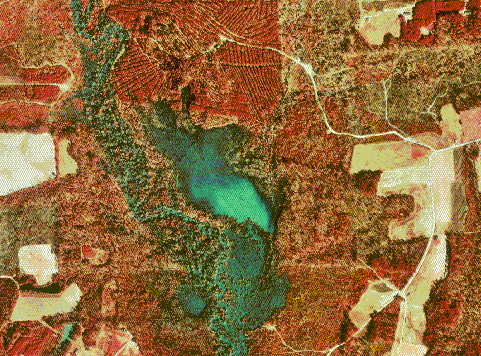
17. Infrared aerial photo

http://www.outintheboonies.com/Arbuckle_Tract/
Infrared film captures images that are both visible and invisible on the electromagnetic spectrum.
IR aerial photos are obtained by satellites, high altitude aircraft and are useful for looking at vegetation patterns, environmental pollution, effect of human activities and study land form. This is important because without this technology, we would not be able to see the Earth outside of its natural colors, because IR light is outside of our visible range. The wavelengths that infrared aerial film record gives scientists a better understanding of the Earth's surface, and contrasts land/water clearer.

Wednesday, April 2, 2014

16. Cartographic animations

http://rsd.gsfc.nasa.gov/rsd/images/andrew.html
Cartographic animations convey statistical information over a period of time, through multiple frames (using the application of animation via computer or video). Because it can be use to depict change over time, we can use this to check hurricane status and track its movement. In this map of Hurricane Andrew, we can see that it moves east to west as we track its progression across the state, coast and use this to predict future paths and forecast.

15. Statistical maps

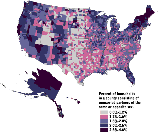
http://www.censusscope.org/us/map_unmarried.html
A statistical map work with government census data to plot the variation in the quantity of the information in the indicated geographic area. It could be any kind of information such as ethnicity, income, housing, so that these maps can identify patterns and trends across the country or whatever parameters that is desired. Statistical maps uses color and symbols such as this map showing unmarried partners in the United States. Viewers can gather that the largest population in the US that's unmarried lives in Menominee County, Wiscinson (4.6%). In general, this map shows that that unmarried households are a small percentage of U.S. households.

14. Cartograms

http://www.brainpickings.org/index.php/2010/04/15/cartograms/
Cartograms distort the space of the map to convey non-geographic information. It is a way to represent historical, social, political, economic, health data across the world. This map reflects on the real dimension of the global external debt. The green shows a more economically stable place compared to the red. The distortion of the red region and dramatic shape helps viewer get a visual representation of information that is otherwise hard to imagine. In political campaigns, cartograms are useful in show which party is gaining and which districts have changed. I found another great example on this site, which show three cartograms of the 2010 US midterm election.

13. Flow maps

http://ops.fhwa.dot.gov/freight/freight_analysis/faf/faf2_reports/reports7/c5_assign.htm
A flow map show the movement of a specific object from one location to another, such as the amount of goods being traded, number of people migrating, flight paths, etc. In this case, the Freight Management and Operations of the U.S. Department of Transportation came up with an estimated annual truck flow (from 2002) to see how the federal highway administration is functioning. This is effective for addressing a variety of methods for transportation as well as determining the highway capacity performance measures and minimize any challenges they have. This flow map technique help indicate what is being moved, direction, source, destination, and general information on how and what is being flowed.

12. Isoline maps

http://www.lib.utexas.edu/maps/atlas_mexico/
Isoline map has continuous lines that connect points on map to indicate places with equal values, altitude, temperature, barometric pressure, wind speed, wind shear, direction, etc. Isolines are effective in communicating the distributions that are being examined (in this case, precipitation) quickly. Meteorologists commonly use isolines for weather analysis. We will be exploring the many types of Isoline maps in the coming blog posts.

11. Proportional circle maps

https://www.flickr.com/photos/89769525@N08/with/8242929652
Proportional circle maps show quantity of a specific data, and it is divided in proportional sizes compared to the components. The owner of this map wanted to see which states use the most oil. They typed in their data on excel to calculate the size of each circle, and in Adobe Illustrator, created the circle representation of oil consumption in each state. There are many advantages of displaying a proportional circle map such as displaying a large data in a visual form that's easy to read to all viewers/media, minimal explanation, and the relatie proportion represents an accuracy of calculations. On the other hand, some disadvantages are that it does not reveal exact values, doesn't show change over time and other key details such as assumptions cause, effect, patterns.

10. Choropleth maps

http://my.ilstu.edu/~jrcarter/Geo204/Choro/Tom/
Chloropleth maps are thematic, where each spatial unit is defined with a uniform color/pattern to describe a specific set of data. The defined areas indicate an average value of quantity (or property) in those areas. For example in this map you can see that the percent of Hispanics in Florida by county is organized in a ratio value, and uses a green graded color series to depict the intensity (from light yellow to green).

9. Dot distribution map

http://gothos.info/2013/03/the-geography-of-us-public-libraries/
A distribution map utilizes dots or other symbols to represent the presence, quantity, or value of a phenomenon or thing in a specific area. In a dot distribution map, the size of the dots is scaled in proportion to the intensity of the variable. Looking at this specific map about how many public libraries there are in the US, we can quickly see a clear depiction of what areas are clustered with more libraries. It is useful for researchers and analysts who can compare the northeast region versus the central west  as it is evident that the northeast region of the United States have the most public funding. 

Thursday, February 20, 2014

8. Propaganda Map

http://irregulartimes.com/empiregeography.html
The relationship we have with maps is reciprocal. We shape maps as much as maps shape us. For that reason, human-made maps can be used to impact our perceptions, consequently swaying our opinions. A propaganda map conveys information that is not always accurate, and can be intentionally misleading for the purpose of representing irregular geography. In this example, this map is trying to send readers the message of where America's foreign policy is heading towards under the Bush administration. If you click on the map source, it will bring you to the page where the writer is using this map to scare viewers into the geographic representation of "our future." It is implying disapproval of Bush's military agenda for pursuing an empire that is considered to be dangerous and hostile. This is effective because visual propaganda is so influential in depicting a clear image that is easily accessible and will leave viewers with a lasting impression on whatever message propaganda maps want to send.

7. Hypsometric Map

http://www.reliefshading.com/colors/hypsometric.html
This is a hypsometric map of France, a great source to find the elevation of the physical land surface. You can see that the map shows the relief, configuration and height of the area by using contour lines. In addition this map uses hypsometric tints, a technique requiring hues of colors to show elevation. Specifically, you can examine that the relatively light colors represent the higher areas, and the brighter the colors, the higher the elevation. The use of tinting is a method of hypsometric maps that allows for more depth of land features.


6. PLSS Map

http://nationalatlas.gov/articles/boundaries/a_plss.html
A PLSS map stands for Public Land Survey System, a surveying method that spatially identify land parcels by subdividing public domain lands. It is used to locate area, identify land ownership and is actually measured on ground by surveyors. Typically, PLSS map divides the land into 6-mile-square townships, then subdivided into 36-one-mile square section, and sections can be further divided into quarter sections. North to South zones are townships and East to West zones are ranges. As seen in this map in the off white/grey states, PLSS covers the majority of the U.S. but it does not cover the original 13 colonies, Texas, and parts of Florida, Louisiana, New Mexico, and California. This map also shows the principal meridians and baselines of the PLSS, separating each patch of color by different regions.

Wednesday, February 19, 2014

5. Cadastral Map

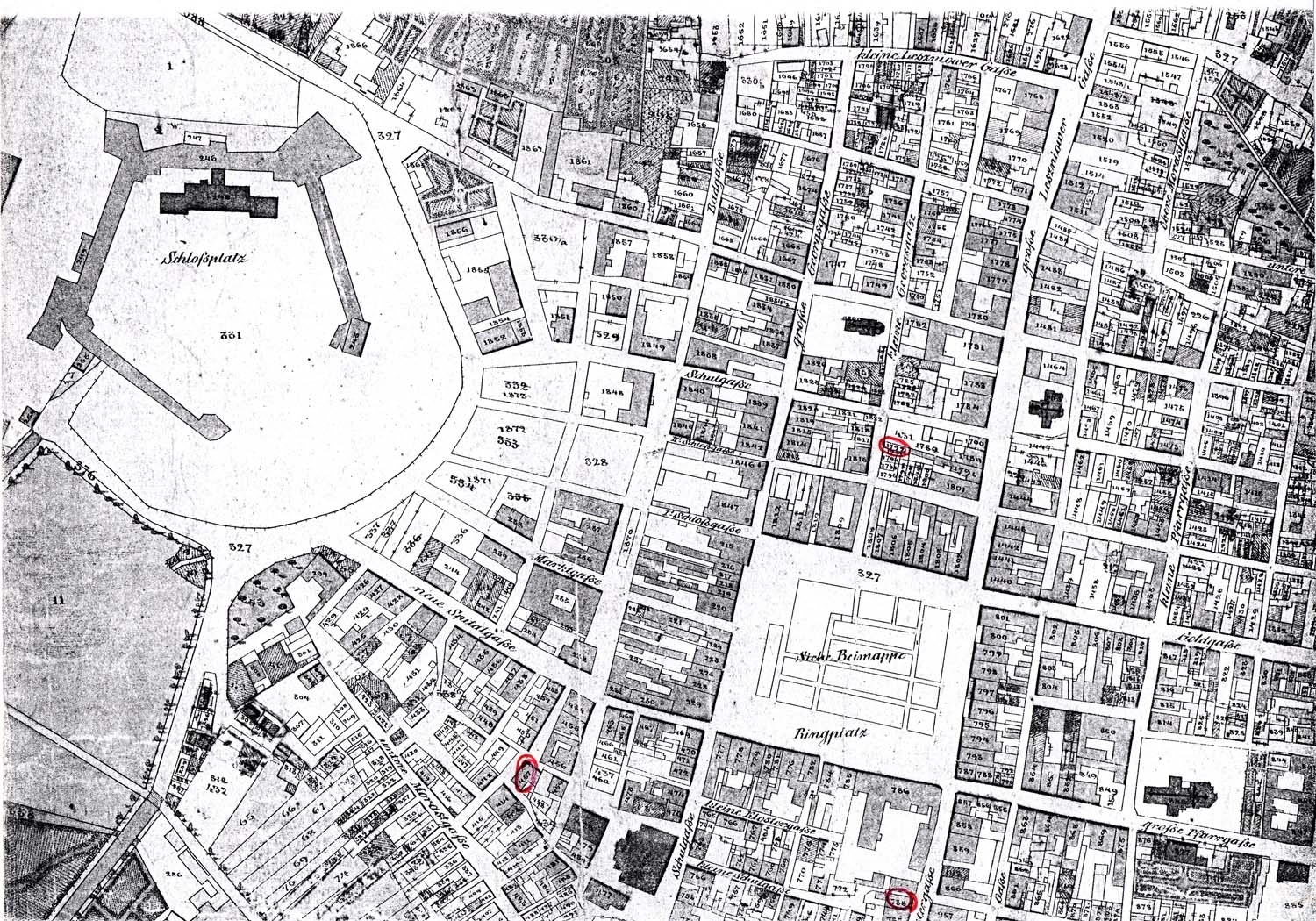
http://kehilalinks.jewishgen.org/brody/sherins_cadastral_map1.2.html
This is a Cadastral Map of Brody, Austria in 1844. A cadastral map provides information about real property in a specific area. It can include information about tax rates, landowners, zoning and structures of the region so that viewers can earn about the land. Fun fact: it has been used as a source to settle disputes between landowners and tenants because some cadastre surveys can have history of land use and owners. Most importantly, it is used for real estate to examine the property's metes-and-bounds. For more examples of typical cadastral maps, click here. I have found a great site that has many cadastral maps from all over the world.

4. Thematic Map

http://udel.edu/~csiwinsk/frec480/proj1/
Thematic map shows information of a particular theme of a specific geographic area. It portrays characteristics of a city, state, nation or continent. Some themes could be social, cultural, economic, agricultural or physical aspects of a region. This is a thematic map of the elderly population in 2000. The legend demonstrates the key color for finding the average elderly population in specific cities. The purposes of a thematic map is to provide information about a particular location and spatial patterns. There are several types and methods of making a thematic maps that will be presented later on in this blog such as: dot distribution, choropleth, proportional circle, isoline and flow maps.