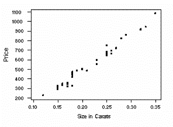
A scatterplot plots points to show the relationship between two sets of data, to find a correlation. If the two sets are strongly linked, that means they have a high correlation, and can either be positive or negative. In this example, the size of a diamond in carats and its retail price are observed. We can clearly see that there is a positive correlation between size and price. Because the plots are so close together and line up near perfectly (with little scatter), this is a high positive correlation. Which means that the bigger the size, the more expensive the diamond is.
No comments:
Post a Comment