Thursday, February 20, 2014

8. Propaganda Map

http://irregulartimes.com/empiregeography.html
The relationship we have with maps is reciprocal. We shape maps as much as maps shape us. For that reason, human-made maps can be used to impact our perceptions, consequently swaying our opinions. A propaganda map conveys information that is not always accurate, and can be intentionally misleading for the purpose of representing irregular geography. In this example, this map is trying to send readers the message of where America's foreign policy is heading towards under the Bush administration. If you click on the map source, it will bring you to the page where the writer is using this map to scare viewers into the geographic representation of "our future." It is implying disapproval of Bush's military agenda for pursuing an empire that is considered to be dangerous and hostile. This is effective because visual propaganda is so influential in depicting a clear image that is easily accessible and will leave viewers with a lasting impression on whatever message propaganda maps want to send.

7. Hypsometric Map

http://www.reliefshading.com/colors/hypsometric.html
This is a hypsometric map of France, a great source to find the elevation of the physical land surface. You can see that the map shows the relief, configuration and height of the area by using contour lines. In addition this map uses hypsometric tints, a technique requiring hues of colors to show elevation. Specifically, you can examine that the relatively light colors represent the higher areas, and the brighter the colors, the higher the elevation. The use of tinting is a method of hypsometric maps that allows for more depth of land features.


6. PLSS Map

http://nationalatlas.gov/articles/boundaries/a_plss.html
A PLSS map stands for Public Land Survey System, a surveying method that spatially identify land parcels by subdividing public domain lands. It is used to locate area, identify land ownership and is actually measured on ground by surveyors. Typically, PLSS map divides the land into 6-mile-square townships, then subdivided into 36-one-mile square section, and sections can be further divided into quarter sections. North to South zones are townships and East to West zones are ranges. As seen in this map in the off white/grey states, PLSS covers the majority of the U.S. but it does not cover the original 13 colonies, Texas, and parts of Florida, Louisiana, New Mexico, and California. This map also shows the principal meridians and baselines of the PLSS, separating each patch of color by different regions.

Wednesday, February 19, 2014

5. Cadastral Map

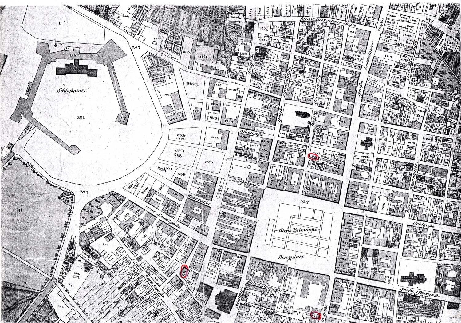
http://kehilalinks.jewishgen.org/brody/sherins_cadastral_map1.2.html
This is a Cadastral Map of Brody, Austria in 1844. A cadastral map provides information about real property in a specific area. It can include information about tax rates, landowners, zoning and structures of the region so that viewers can earn about the land. Fun fact: it has been used as a source to settle disputes between landowners and tenants because some cadastre surveys can have history of land use and owners. Most importantly, it is used for real estate to examine the property's metes-and-bounds. For more examples of typical cadastral maps, click here. I have found a great site that has many cadastral maps from all over the world.

4. Thematic Map

http://udel.edu/~csiwinsk/frec480/proj1/
Thematic map shows information of a particular theme of a specific geographic area. It portrays characteristics of a city, state, nation or continent. Some themes could be social, cultural, economic, agricultural or physical aspects of a region. This is a thematic map of the elderly population in 2000. The legend demonstrates the key color for finding the average elderly population in specific cities. The purposes of a thematic map is to provide information about a particular location and spatial patterns. There are several types and methods of making a thematic maps that will be presented later on in this blog such as: dot distribution, choropleth, proportional circle, isoline and flow maps.

Tuesday, February 18, 2014

3. Topographic map

http://en.wikipedia.org/wiki/Topographic_map
In direct contrast to the previously discussed planimetric maps, a topographic map show horizontal and vertical relief positions of the features.This map utilizes contour lines to depict shape and elevation on the area. The terrain can be seen in a 3D aspect versus 2D. There are two types of topographic maps: contour and shaded-relief. The contour map (which is the type shown in this example) is the most common type to show so that all topographical features can be shown. For example: slopes, depressions, ridges, cliffs, etc. This map is characterized by large-scale detail and takes into account natural and man-made features of the terrain as depicted above.

2. Planimetric Map

http://www.tallahasseefloridarealestate.nefla.com/tallahasseefloridamap.htm
Planimetic Maps represent location of boundaries, roads, parks, rivers, lakes, creeks, local government boundaries and buildings. They show surface maps without relief features or their relationship to hills and valleys. In this map, the 2D representation show an example of a basic street map that includes information about public school (FSU), hotel, lakes, creeks, etc. One thing that this map depict well is main street/road names of the town. Here is another great example of a planimetic map in great detail of New York. In the legend you can find that the Planimetric map includes buildings, sidewalk, parking, water bodies, roads. In addition, there are historic sites, museums, town hall church, post office, library and cemetery.

1. Mental Map


Mental mapping is an individual's perception on their world and how they interact with it. The concept behind a mental map is to visually represent the point of view of the person drawing the map. It showcases how they view the world, where they have been, what they know about place and most importantly, how they organize and store mapping information in their brain.  Essentially, this is unique from person to person. This map is a sketch of a neighborhood drawn by a resident in Nottingham City. It depicts streets, locations, plazas, and residential homes that this person associated the most with in his/her daily life. If you click on the Map Source, there is another drawing of a second person's mental map. You can compare how different the second mental map is from the first, and examine the information they provide. Each person decides what they want to put on the map, how the shape appears to them, and create different details and boundaries on their perceived locations.